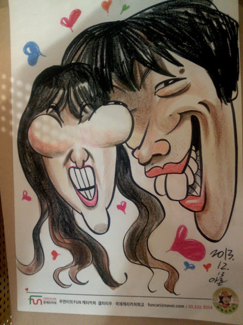
There's no love like stinky love.
A dark brown background can help make your colors pop out a bit. Chroma contrast. I learned that back in college. There's supposedly three dimensions to color: Value, Chroma, and hue. Do you know about this? Value is the difference between black and white; chroma is the difference between red and gray, and hue is the difference between red and green, or yellow and purple—or any opposing sides on the color wheel. When I was a little kid I remember asking my mom if a color has an opposite and she said no, but later on I figured she was wrong because the opposite of red is green. But she wasn't wrong, because green is only opposite if you're talking about red hue, and I wasn't.. Let us continue.
This caricature feels like safety.
This caricature feel like doorknob. These girls were too fun and cool and down for whatever.
Selling a caricature with acne is always a victory.
Hair near the eyes is a bother to draw. What are some other bothers to draw? I will list them:
complex eye brows
ears
long hair that was just up in a pony tail moments ago
identical twins
hanging roller-coasters
motorcycles. Alright that's enough.
complex eye brows
ears
long hair that was just up in a pony tail moments ago
identical twins
hanging roller-coasters
motorcycles. Alright that's enough.
She looks like Kenny Banya.
Fun Korean couple. The girl was a little huffy after it all, but I'd be huffy too if someone botched my baseball implants.
Not to toot my own horn, but they looked just like this..and probably still do.
I think she asked for pretty, but they always ask for pretty. What am I? The beauty doctor?
It's not everyday you get to draw conjoined twins. This couple was cool. They really seemed to be conjoining themselves.
Maybe she was a wicked Irish devil. Maybe he was an all American church softball heart-throb, none of that was important. All that was important was their love. And so she climbed up the ladder of his arm and kicked him in the face.
She complained about it a lot, but she got a frame. This is the spam face-shape, not to be confused with the soap face-shape which is horizontal. I think next week I'll do a thing about shapes. I have some ideas.
The elephant's foot face shape. You'd be surprised how many Asians don't look like Asians but rather just like funny looking white people.
Well, this is a framer too, actually. Bust my buttons!
I got her pretty good on this one. She wouldn't let me take her photo so that's how you know.
This girl had some eye surgery done. I can tell. She kind of looks like a villainous queen. I don't think he liked this sketch too much. The drawing before this was very very um..shall I say..cautious, but he was cool though.
Surely, there's a place in caricature for structure and solidity, but I got a warm spot, I must say, for some stray lines floating around like some endoplasmic reticulums.


No comments:
Post a Comment